[PT]
Unir engenharia civil de alta performance com a qualificação profissional de quem executa a obra. O Instituto Bureau atua exatamente nesse cruzamento de demandas do mercado brasileiro. Existe um déficit histórico de infraestrutura no país, acompanhado por um apagão de mão de obra técnica e pela urgência das corporações em atender exigências de compliance e ESG. A organização resolve o problema físico da construção enquanto entrega impacto social autossustentável.
O projeto de branding precisava equilibrar duas forças distintas. A marca deveria projetar a segurança e a precisão da engenharia, mas também o otimismo da emancipação humana. Utilizamos os arquétipos de Jung para estruturar essa personalidade. O Criador lidera as ações, o Sábio garante a capacidade técnica e o Mago representa a mudança na vida das comunidades. Dessa base extraímos o propósito da instituição: construir a base física e humana para que indivíduos e comunidades prosperem com autonomia.
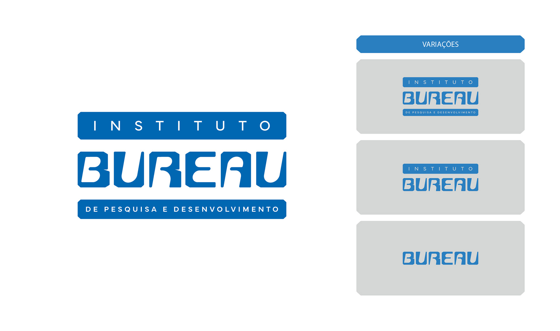
A tradução visual dessa estratégia começou pela tipografia proprietária. O desenho nasceu de uma grade modular, estruturada em blocos que remetem à própria construção civil. Acrescentamos peso às letras para atestar robustez e estabilidade. Um ajuste crítico ocorreu nas contraformas das letras. Arredondamos os espaços negativos para quebrar a dureza excessiva, injetando um caráter humano e afetuoso no design. A inclinação do eixo finaliza o processo ao aplicar movimento e dinamismo ao logotipo.
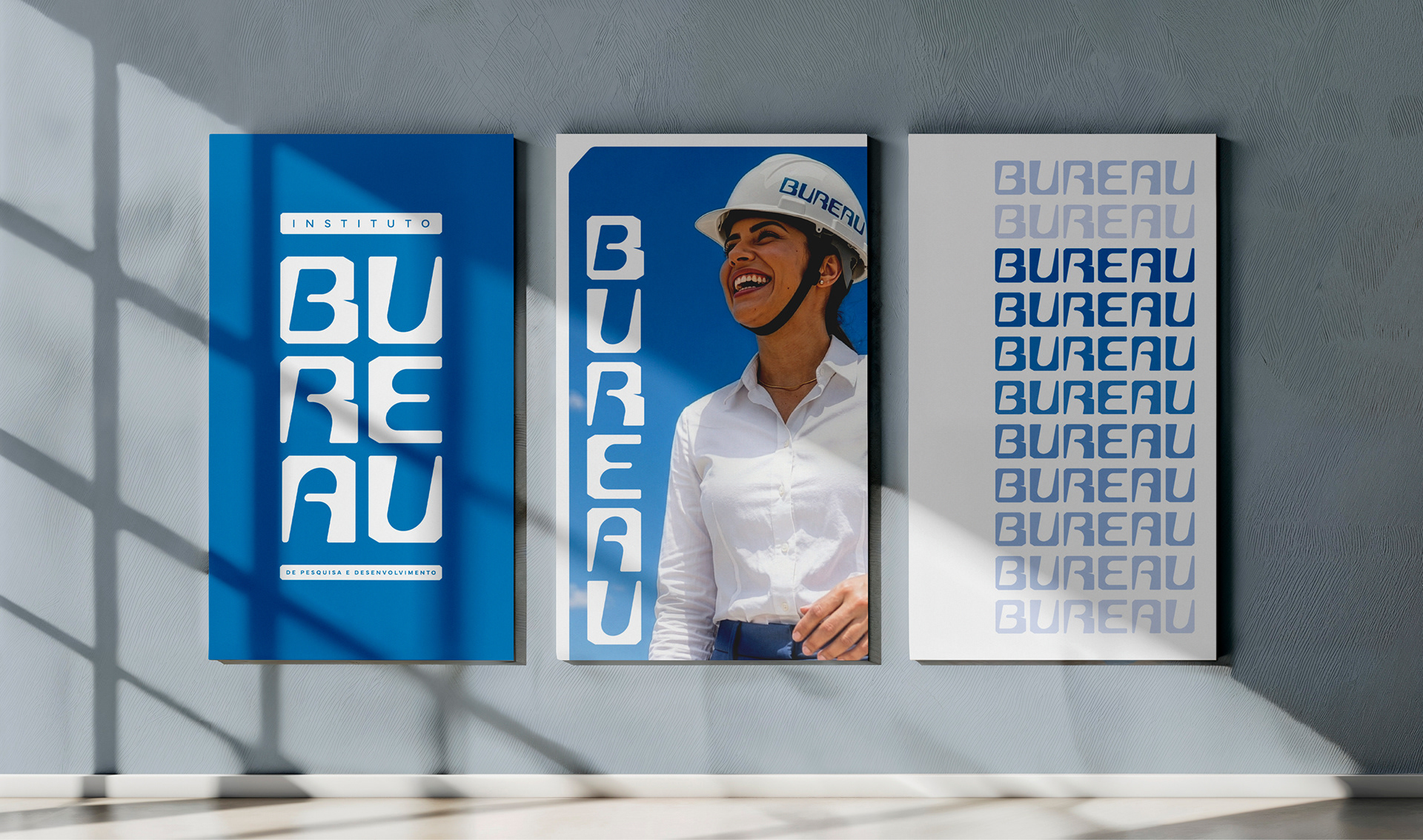
Para a direção de arte e o tom de voz, a escolha foi o otimismo frontal. As fotografias priorizam pessoas reais sempre sob luz solar forte, com o rosto voltado para cima e o céu limpo ao fundo, refletindo a paleta de tons azuis sóbrios e vibrantes da marca.
[EN]
Merging high-performance civil engineering with the professional qualification of those who execute the work. Instituto Bureau operates exactly at this intersection of demands within the Brazilian market. The country faces a historical infrastructure deficit, accompanied by a severe shortage of technical labor and the urgency of corporations to meet compliance and ESG requirements. The organization solves the physical problem of construction while delivering self-sustaining social impact.
The branding project needed to balance two distinct forces. The brand had to project the safety and precision of engineering, alongside the optimism of human emancipation. We used Jungian archetypes to structure this personality. The Creator leads the actions, the Sage ensures technical capacity, and the Magician represents the change in communities' lives. From this foundation, we extracted the purpose of the institution: to build the physical and human foundation so that individuals and communities prosper with autonomy.
The visual translation of this strategy started with proprietary typography. The design originated from a modular grid, structured in blocks that echo civil construction itself. We added weight to the letters to attest to robustness and stability. A critical adjustment occurred in the counterforms of the letters. We rounded the negative spaces to break the excessive harshness, injecting a human and affectionate character into the design. The axis inclination finishes the process by applying movement and dynamism to the logo.
For art direction and tone of voice, the choice was upfront optimism. Photographs prioritize real people always under strong sunlight, looking upwards with a clear sky in the background, reflecting the brand's palette of sober and vibrant blue tones.